Part 2 for Final
Logo Blog Post
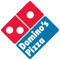 The Domino's logo is successful because they use two contrasting colors to grab customers attention. They also have a good visual built into their logo which plays off of name of the company.
 Shell gasoline is another company with an effective logo. The reason for this is the simplicity behind it. Using thick letters that are easy to read and having a logo that is so easily recognizable is key. This logo can be displayed without the copy and most people will know gas is served at that establishment.
 The gatorade logo has changed over the years but they continue to use the orange electric bolt as their staple. The reason this is successful is because regardless of the small changes to the logo, it remains a timeless symbol that people have come to know globally. In addition this logo works without the copy because of the companies following.
 The Burger King logo uses colors that are proven to be more effective in advertisement. Making the copy in red is smart because it grabs the attention of someone passing by. Also the logo resembles a burger buns surrounding the copy which is a clever play on their name. Another reason this logo works so well is that is can be used in black and white situations as well.
 In the world of kids toys there is a lot of competition. Hot Wheels was able to set themselves apart by having a distinct logo. Because kids are in charge while in the toy store in is important to have a logo that is recognizable among the competitors it may sit with on the shelves. Another this is a good logo is because it is small, simple, and concise. It can be placed on products or blown up larger for advertisement.
Logo Blog Post
Shell gasoline is another company with an effective logo. The reason for this is the simplicity behind it. Using thick letters that are easy to read and having a logo that is so easily recognizable is key. This logo can be displayed without the copy and most people will know gas is served at that establishment.The Burger King logo uses colors that are proven to be more effective in advertisement. Making the copy in red is smart because it grabs the attention of someone passing by. Also the logo resembles a burger buns surrounding the copy which is a clever play on their name. Another reason this logo works so well is that is can be used in black and white situations as well.In the world of kids toys there is a lot of competition. Hot Wheels was able to set themselves apart by having a distinct logo. Because kids are in charge while in the toy store in is important to have a logo that is recognizable among the competitors it may sit with on the shelves. Another this is a good logo is because it is small, simple, and concise. It can be placed on products or blown up larger for advertisement.

Comments
Post a Comment